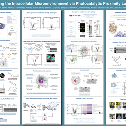
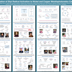
How do I make a scientific poster? Six tips from a Nobel Prize winning team
We love scientific posters at the RSC. A firm fixture at research meetings across the globe – not to forget our #RSCPoster Twitter digital conference – they are a particularly useful tool for early career and established researchers to share their work. Posters can educate, spark new ideas, or even lead to collaborations.
With the Chemical Science Symposium deadline for submitting abstracts for posters on 31 August, we asked our keynote speaker and Nobel Prize winning scientist David MacMillan’s research group at Princeton University what their tips would be for those of you looking to make an impact at Burlington house on 10–11 November with a perfect poster.
1. Prioritise images and diagrams.
We all know the phrase ‘a picture is worth a thousand words’, and scientific posters are no different. After reading the title of your poster and maybe a few supporting lines, most people will make a quick decision whether to approach for a closer look. Naturally, they will be drawn to visual representations rather than chunks of text, which can be intimidating and also be harder for those with poor eyesight to read. Remember that in most cases you will be standing there next to your poster, and so you are there to provide the detail – visual aspects are crucial to help support your conversation and illustrate the points you plan on talking about.
2. Stick to a colour scheme.
At best, a colour scheme can draw attention to your poster, help tell your story and make it look downright beautiful. But we’re not all graphic designers in our spare time, so keeping it simple is often best. Using too many colours can cause clashes and distract your audience. A good rule of thumb is stick to three to five colours – usually you will have a primary colour, a secondary colour and an accent colour which is used sparingly to make things ‘pop’. Try not to use faint colours, which may print out less visible than they appear on your computer screen, and when selecting your colours consider if key information can still be read by those who are colour blind. A little research can go a long way – search online for good colour combinations and take note of their RGB or CMYK numbers, which can be put into most software.
3. Get to know your audience.
A great poster is accessible for both students and for professors. Make sure your descriptions and explanations are scientific but not overly technical, as this may cause confusion. Not everyone at an event will be an expert directly in your field, but interdisciplinary points of view or collaborations can be valuable. When it comes to presenting your work you can ask about the listener's research background to get a feel for what to explain, and what is probably too much information. Analyse their responses and body language to make sure they understand – because presentations are often one on one, you can ask at any time if they have questions. Also, if they don't seem interested, it's okay to finish “pitching” your poster quickly so you can talk about something else. Sometimes the most useful discussions can be the ones you don’t expect or plan for.
4. Remember to tell a story.
Make sure you ensure each piece of data or result included in your poster fits into the bigger picture and brings the audience along to hear the specific story you want them to hear. A poster can’t represent all of your research at once, and so building toward a specific “take home” message can be effective. Poster presentations are often intimate, so tell a story about your research that excites you. You can make things more casual or personable by talking about how what it meant to you when you found a specific result.
5. Be flexible and open to improvisation.
Every person you speak to will have a different background, specific interest in your poster and preferred way of communicating. Some may interrupt you during your presentation with questions, and you should be ready to switch gears and discuss specifics. Don't have a "script" that you follow every time you present, and be sure to expect curveball questions.
6. Design your poster in a logical flow.
Finally, bring all of the above together with a simple and clear layout. We recommend clearly segmenting and bordering off each key aspect of the project with one summarising bullet point underneath each key piece of data. This keeps each isolated piece of information self-contained while also being a structured part of that wider story you are trying to communicate.
You can submit your poster abstract until 31 August here, and the early bird deadline for registering to attend the Chemical Science Symposium is 21 September. Good luck!
With thanks to David MacMillan and Holt Sakai for consulting the Macmillan Group for their tips.


